Ajinkya Bhavik
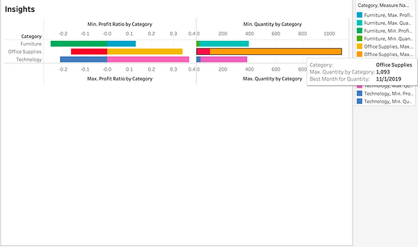
This is my Tableau Dashboard for the visualization of various categories and quantity over a period of time. This visualization also highlights parameters like the best month for profit and the best months for the quantity.